Mylo Website Redesign
Working with marketing, I created a full-scale redesign of Mylo's digital insurance website, driven by the brands need to be both intelligent and approachable. By blending industry best practices with an unmistakable visual identity, we created an experience that’s smart, friendly, and focused on helping customers not just convert, but connect.
creative concepts | UX/UI design | Illustration | Iconography | Animation
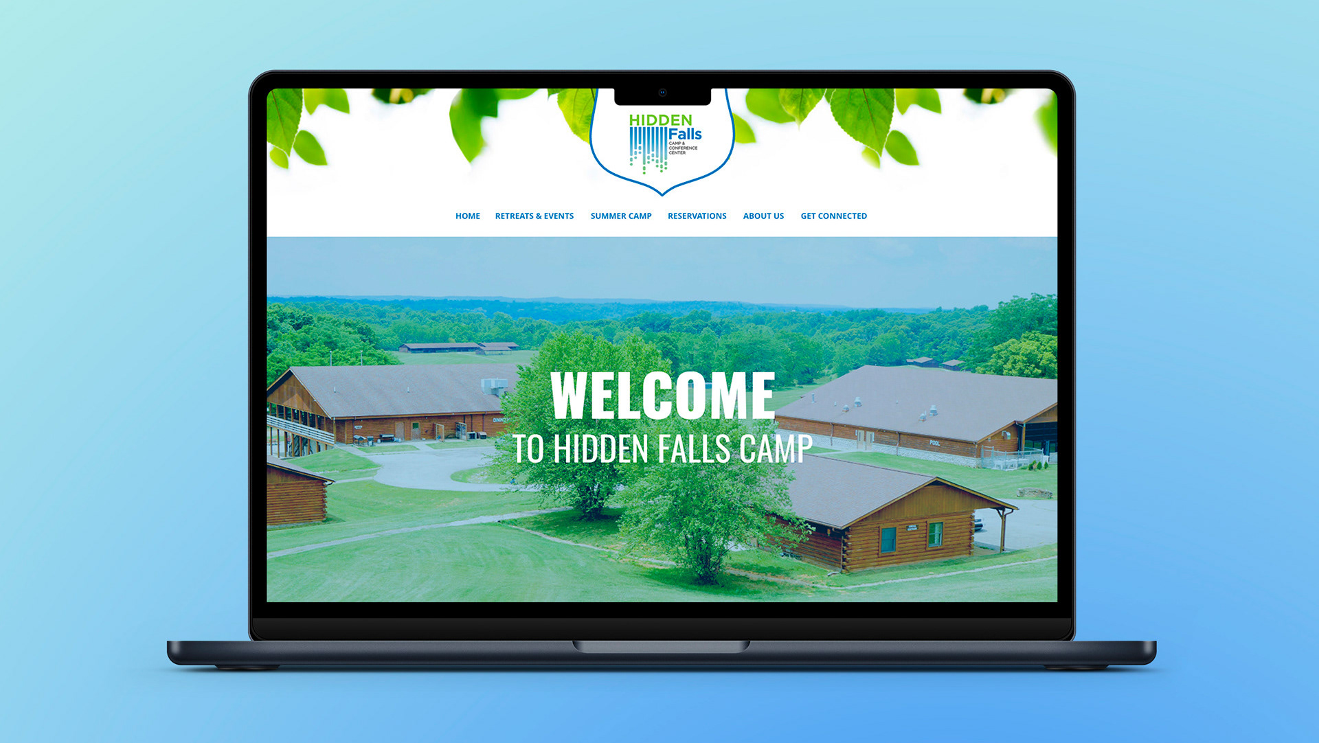
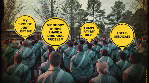
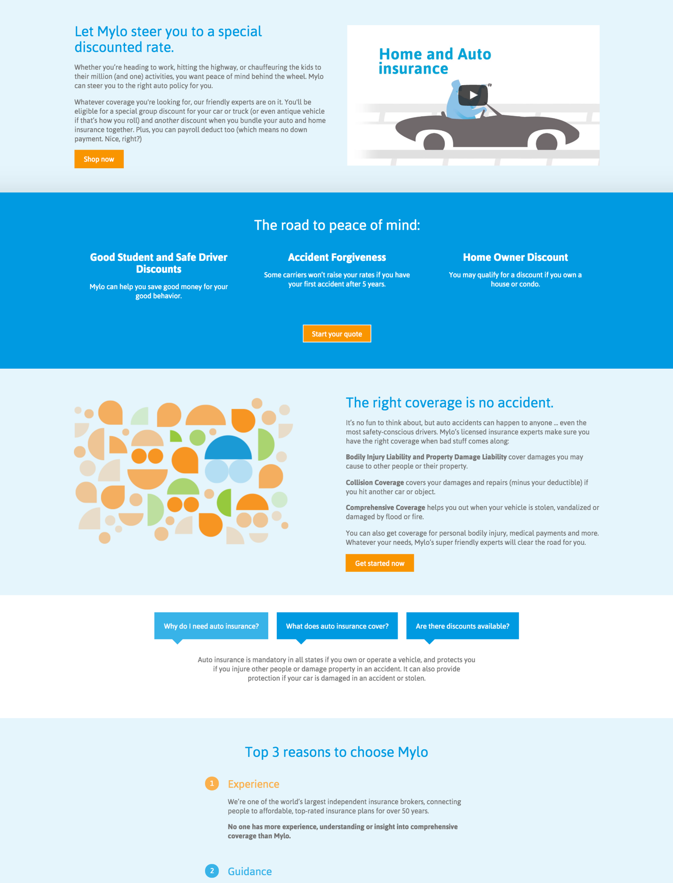
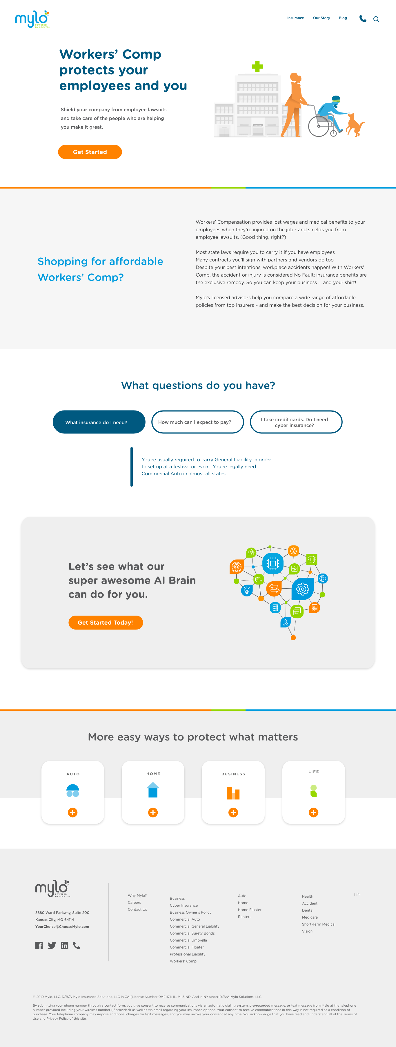
| Previous site design to update
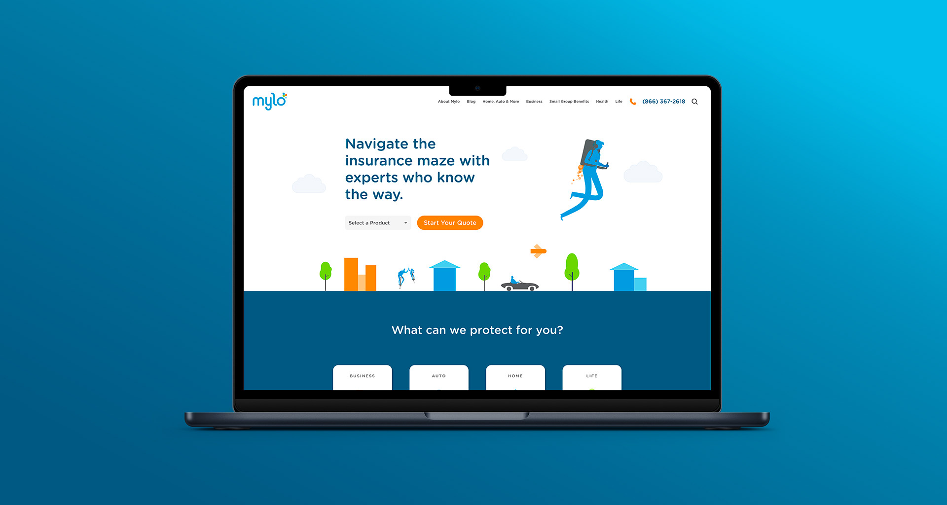
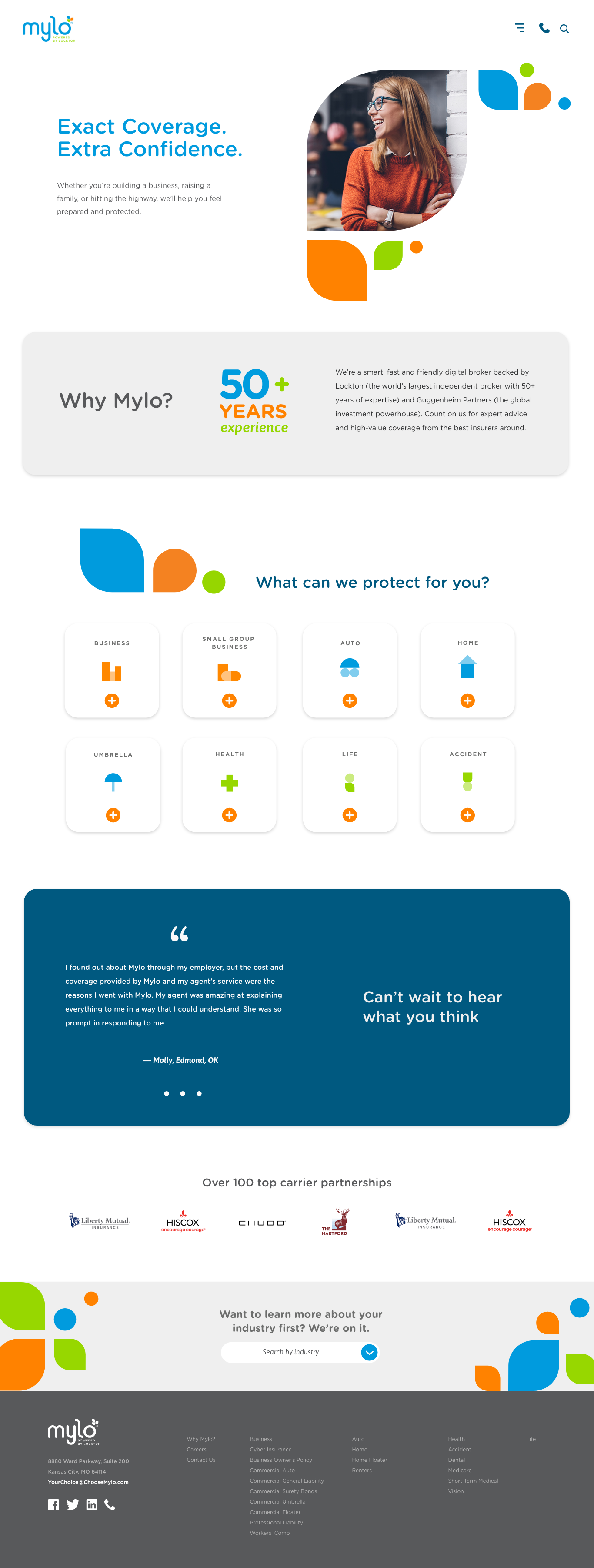
| Working through initial designs
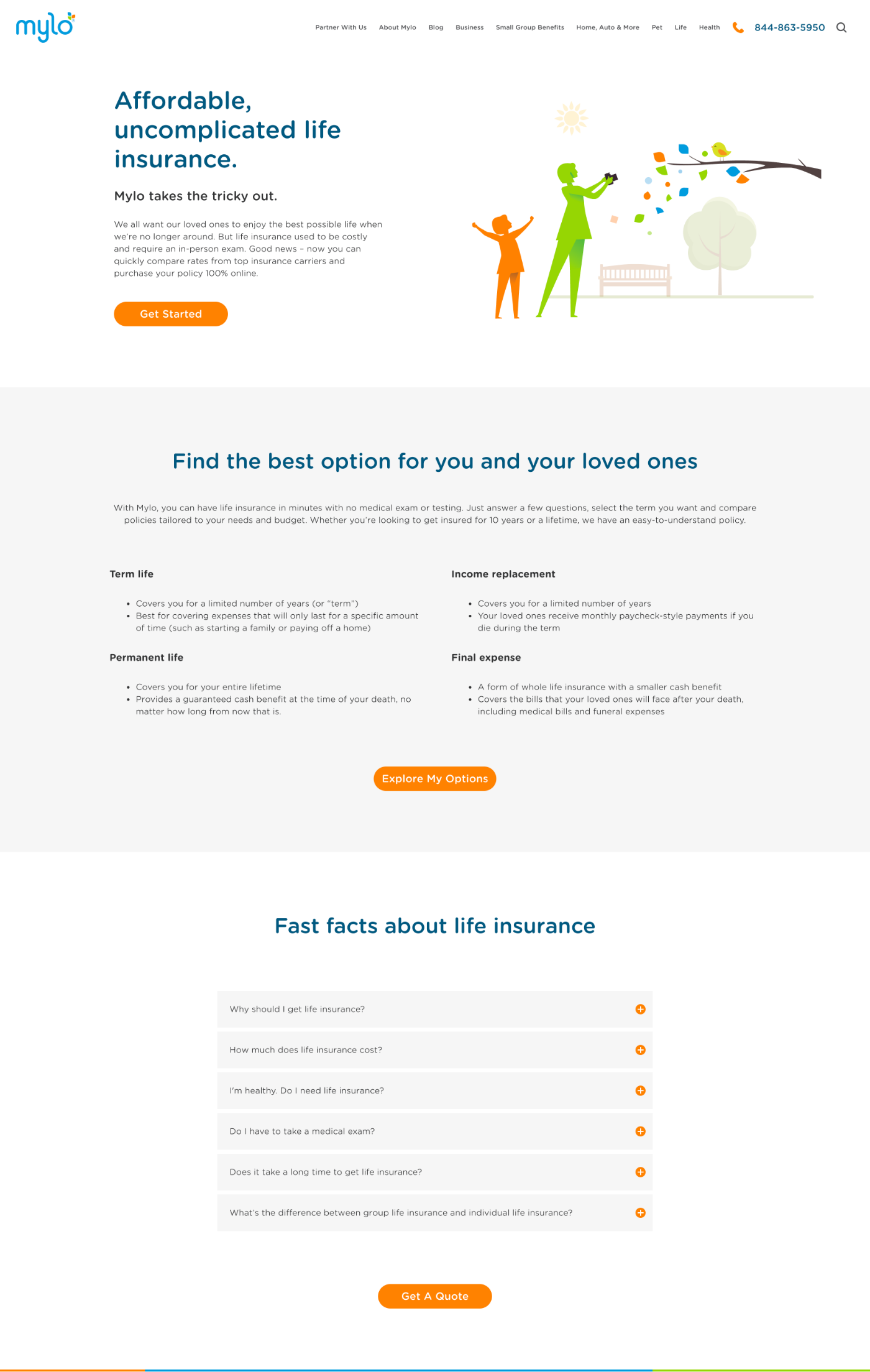
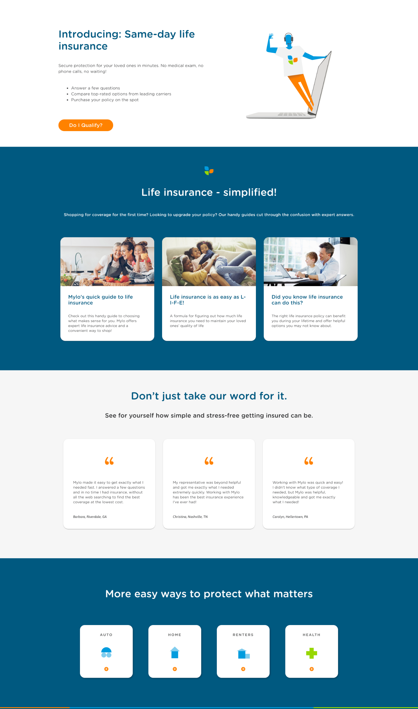
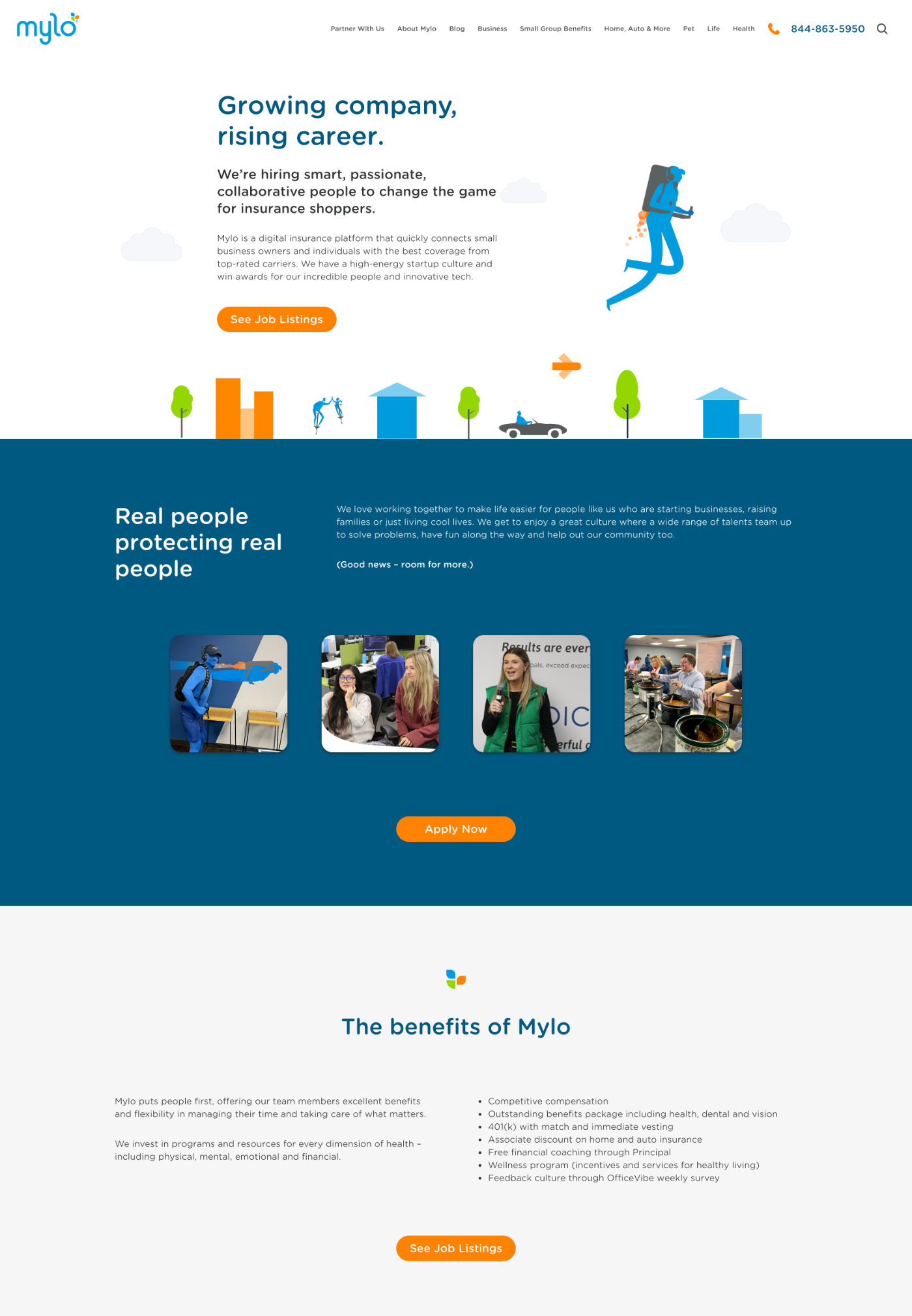
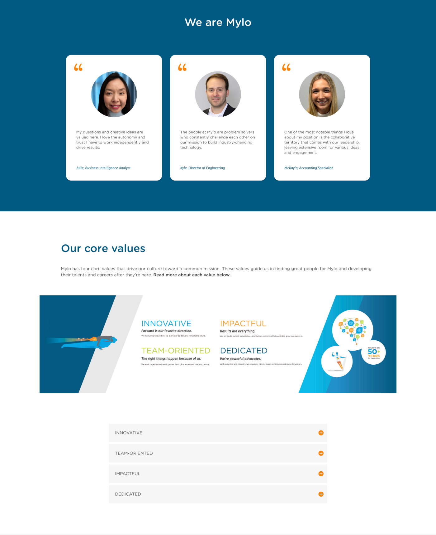
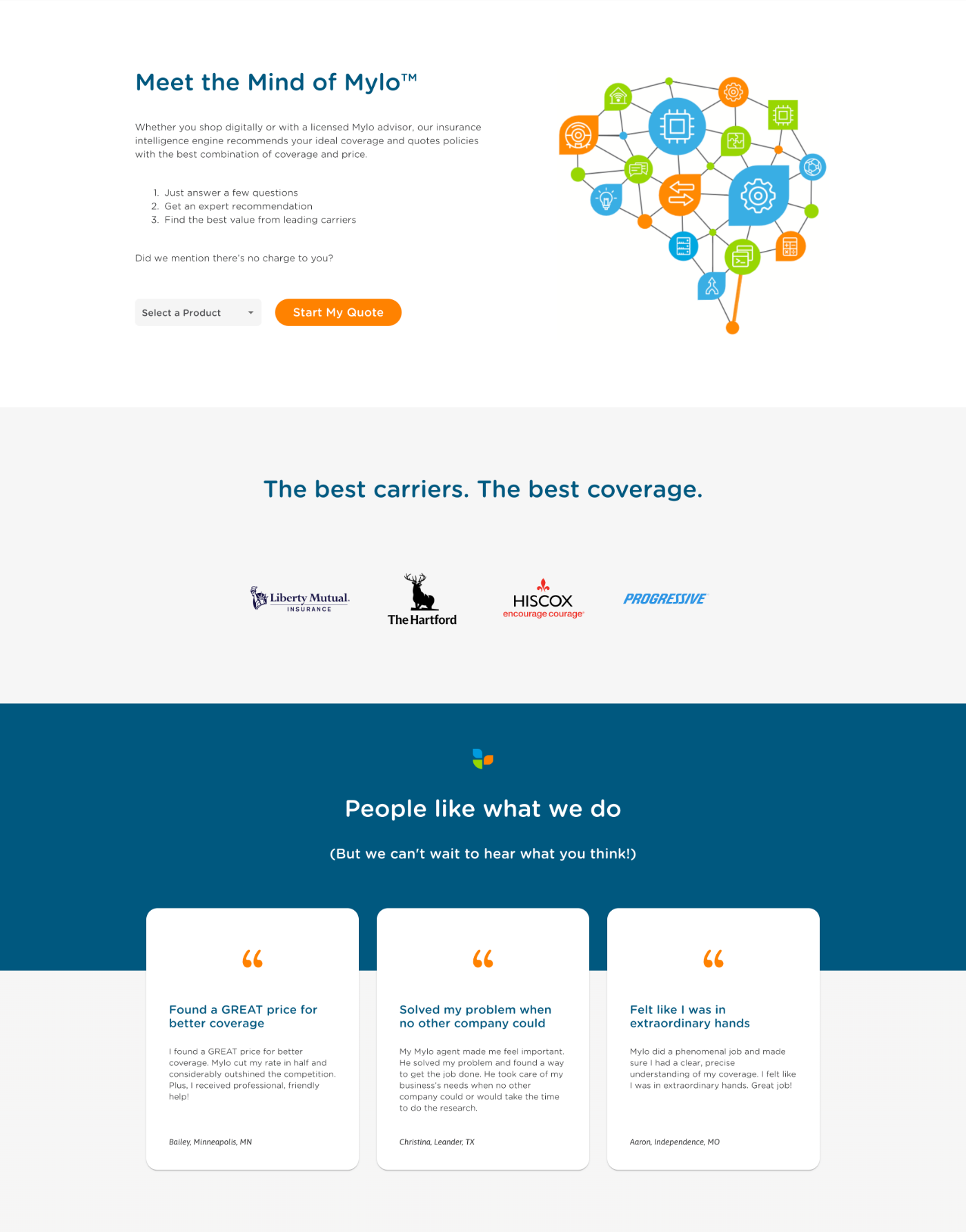
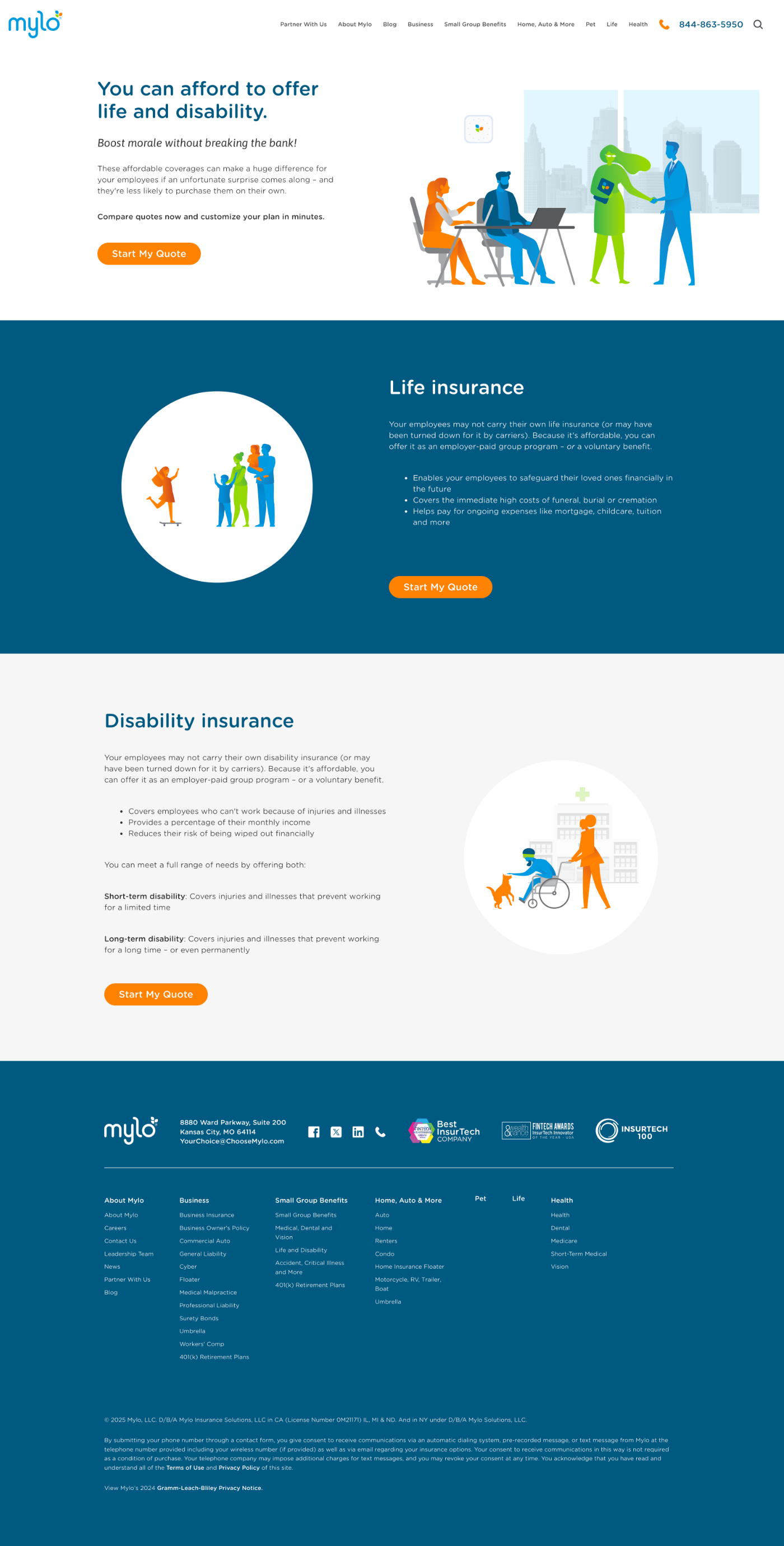
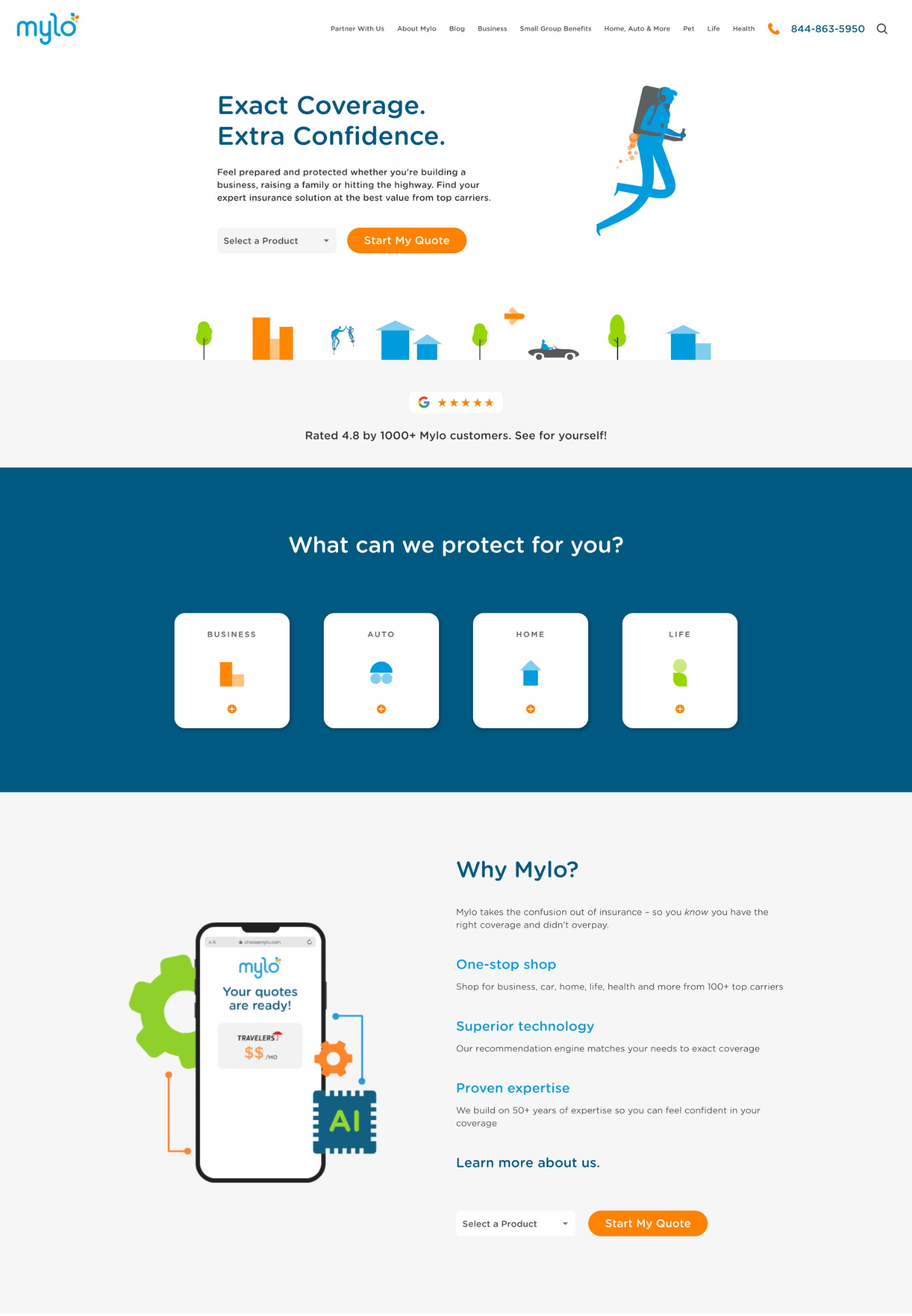
As part of a broader brand update, I moved away from using tints and shades of the brand colors and instead simplified the palette back to the three core colors. I also introduced a new dark blue, along with dark gray for copy and light gray for background flexibility. This streamlined approach created a more striking visual impact while also improving contrast and accessibility across the experience. I replaced sharp corners with rounded ones to better complement the curves of the Mylo logo, resulting in a softer, more approachable aesthetic. Additionally, we increased spacing and reduced visual clutter by minimizing or removing brand shape patterns and streamlining copy. The result was a more scannable layout that made it easier for users to digest content and engage with CTAs.
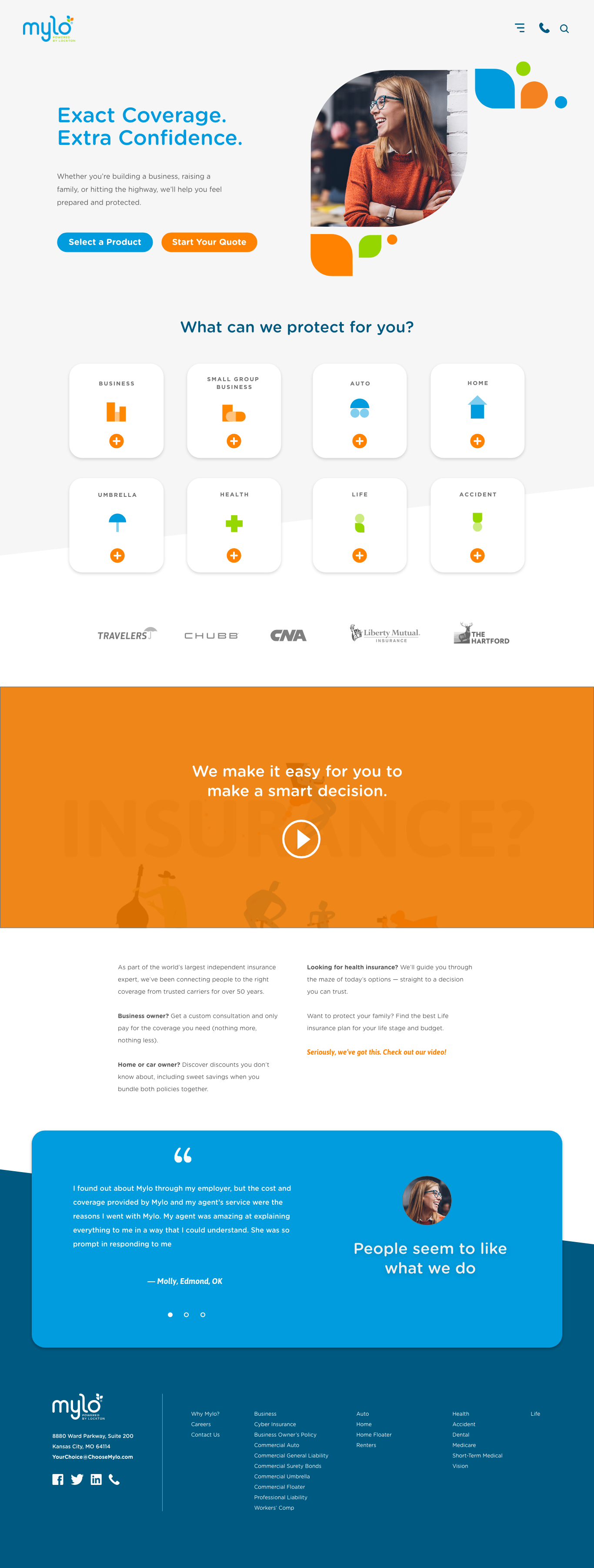
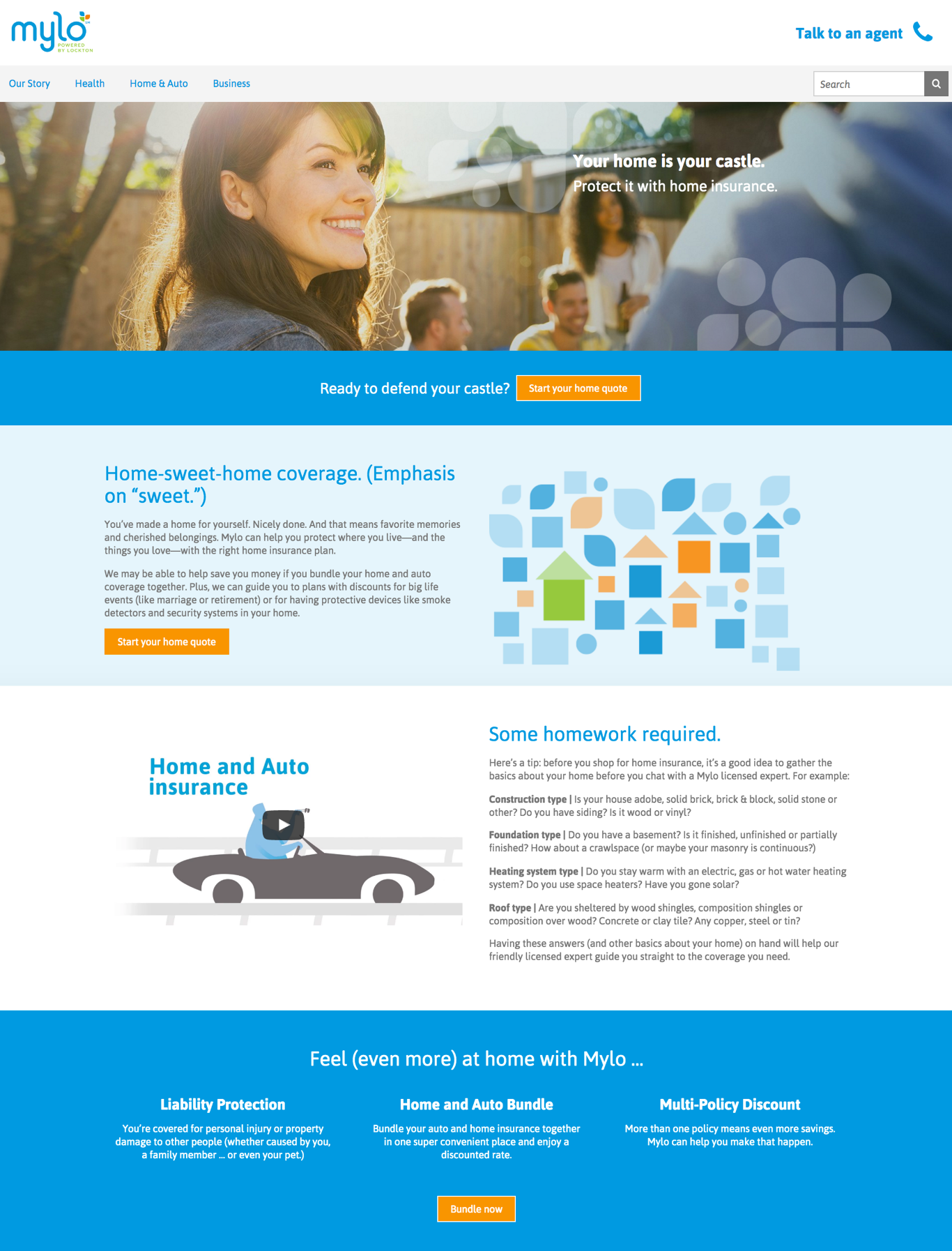
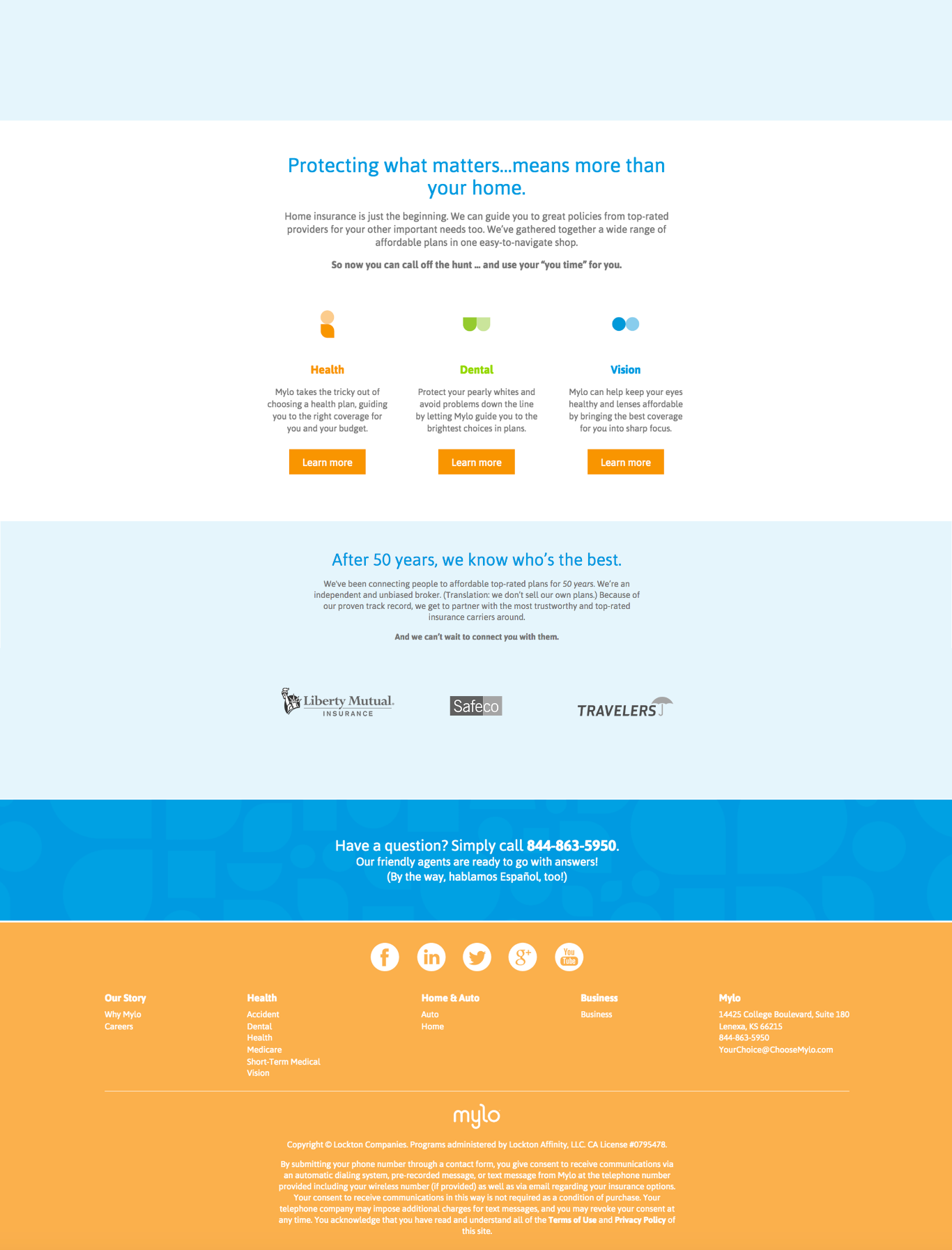
| A Final Design
After review and refinement, These were the finalized UI designs below. The final designs focused on simple iconography, custom illustrations and animations, replacing stock photography to create a more cohesive and distinctive visual experience. Mylo's development team built an in-house user framework, enabling a plug-and-play system that allowed the marketing team to customize page layouts and content. The designs were broken down into interchangeable components, all aligned with the updated branding.
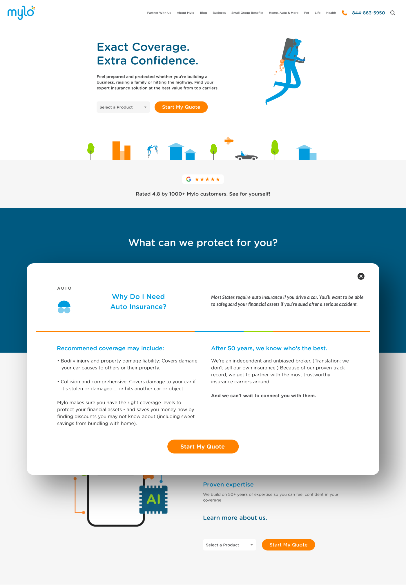
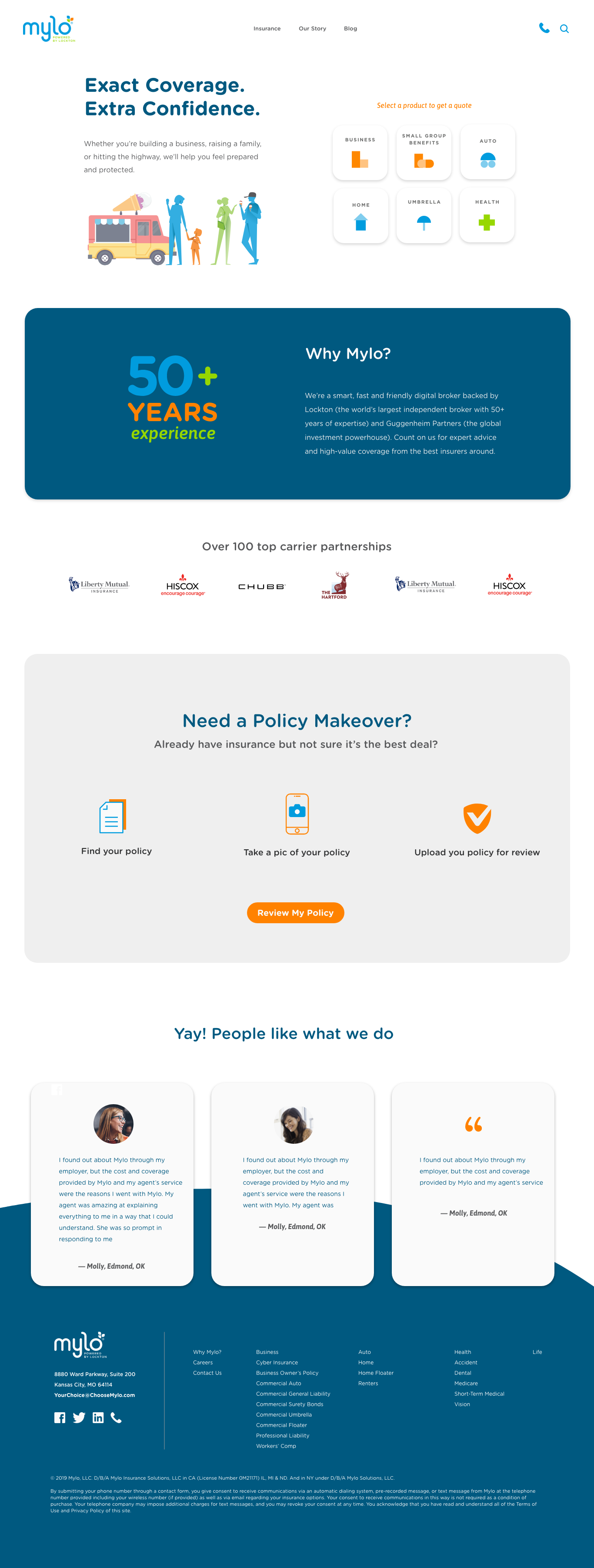
Insurance comes with a lot of detail and complexity. To address this, I designed an expandable card component that reveals additional information on screen. This enabled users to dive deeper into product details without disrupting the initial viewing experience. The component supported a greater volume of content while preserving a clean, focused top-level interface.