Mylo Dashboard designs
Mylo aimed to deliver a better, more unified experience for their agents, who were juggling multiple websites and screens to get their work done. I was tasked with designing a user interface that brought everything together into a single, streamlined workspace—improving efficiency, reducing friction, and supporting a more seamless day-to-day workflow. (select images to expand full screen)
UI Design | Graphic Design
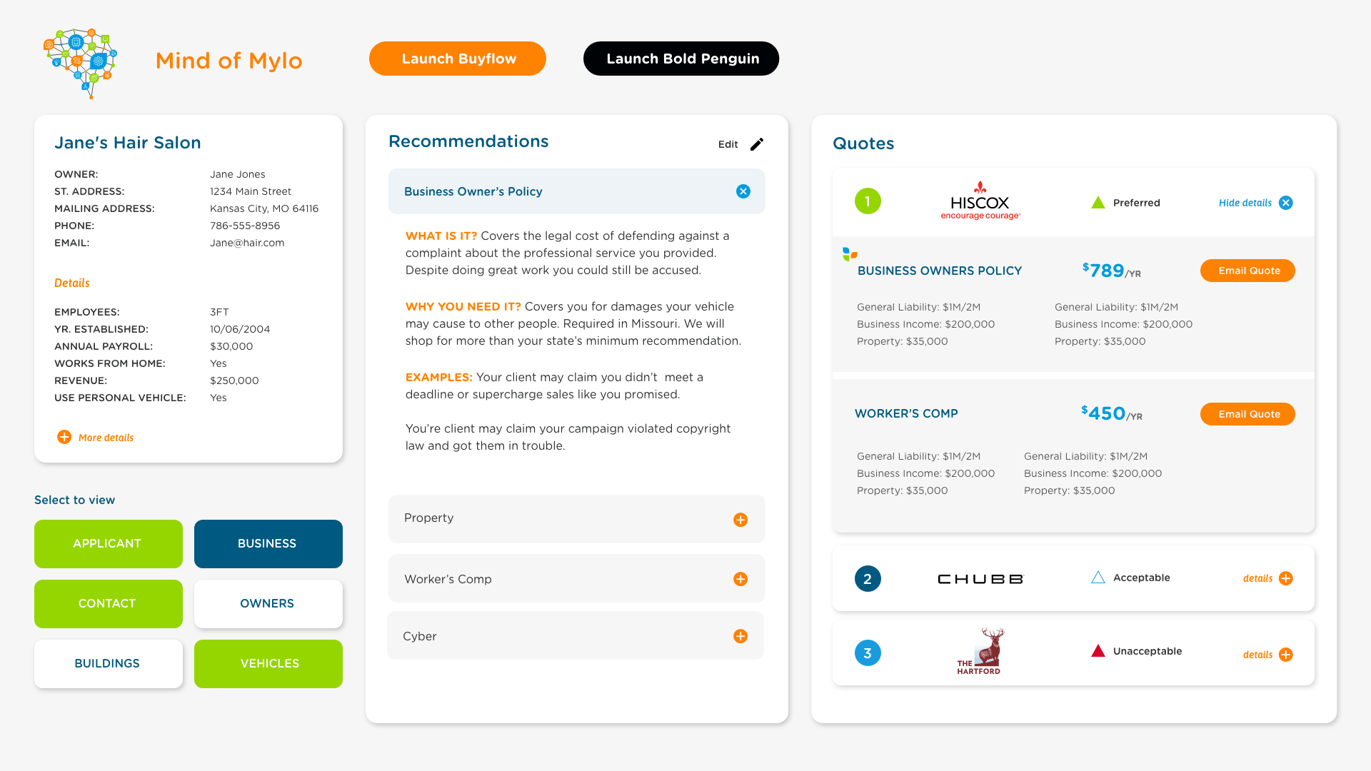
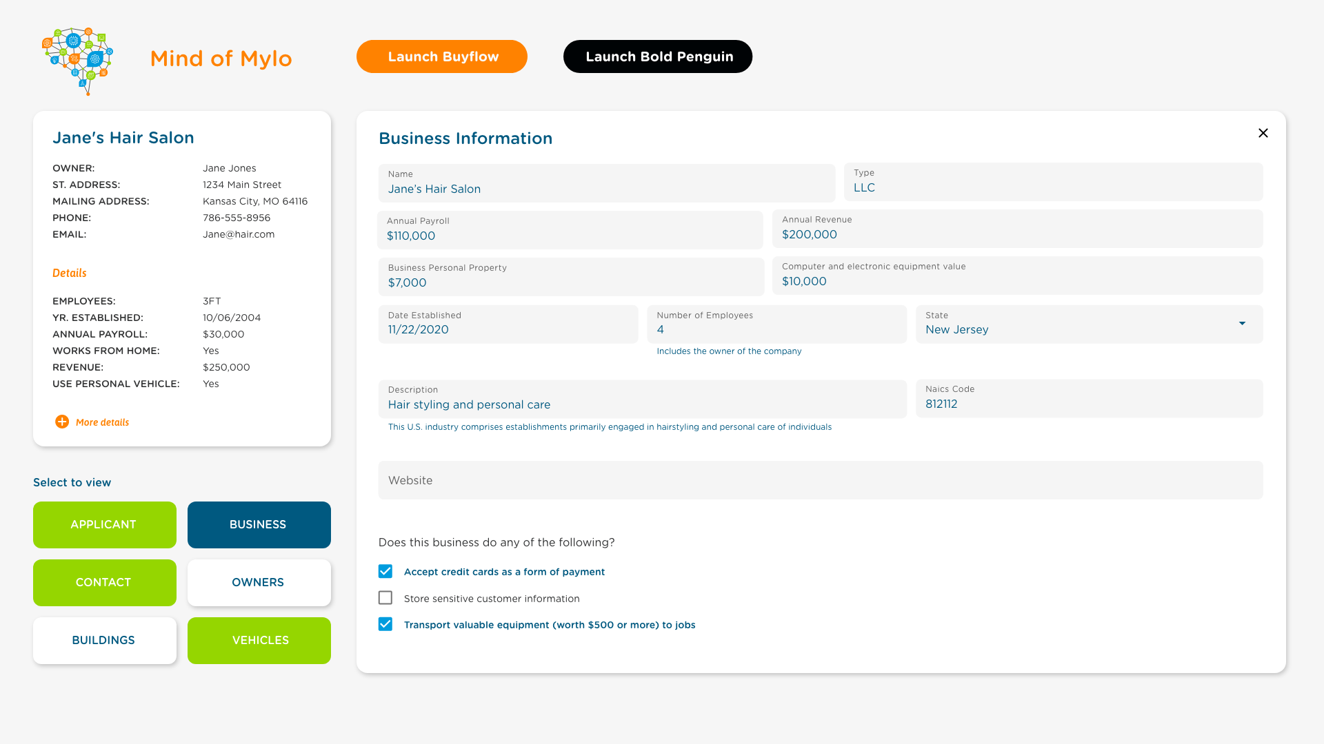
| A Nice Start
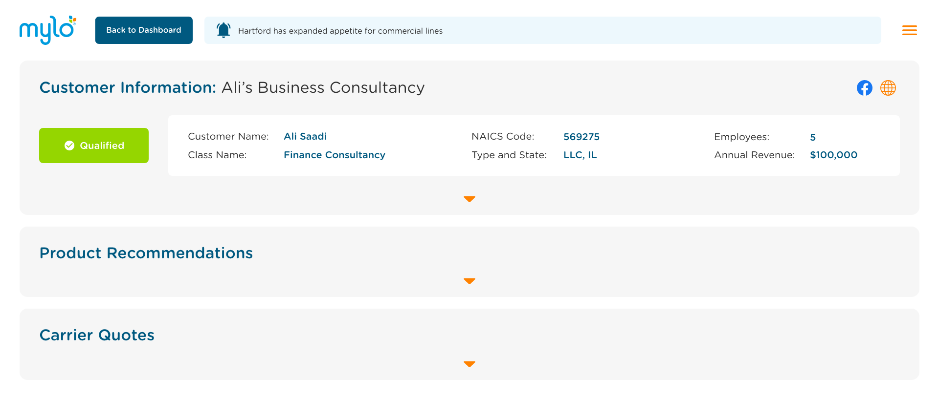
These initial designs illustrate how the sections relate to one another and how buttons and cards enable users to expand into more detail or access longer forms. The main page displays customer information, personalized recommendations once forms are completed, and the quotes returned from Mylo’s quote engine.
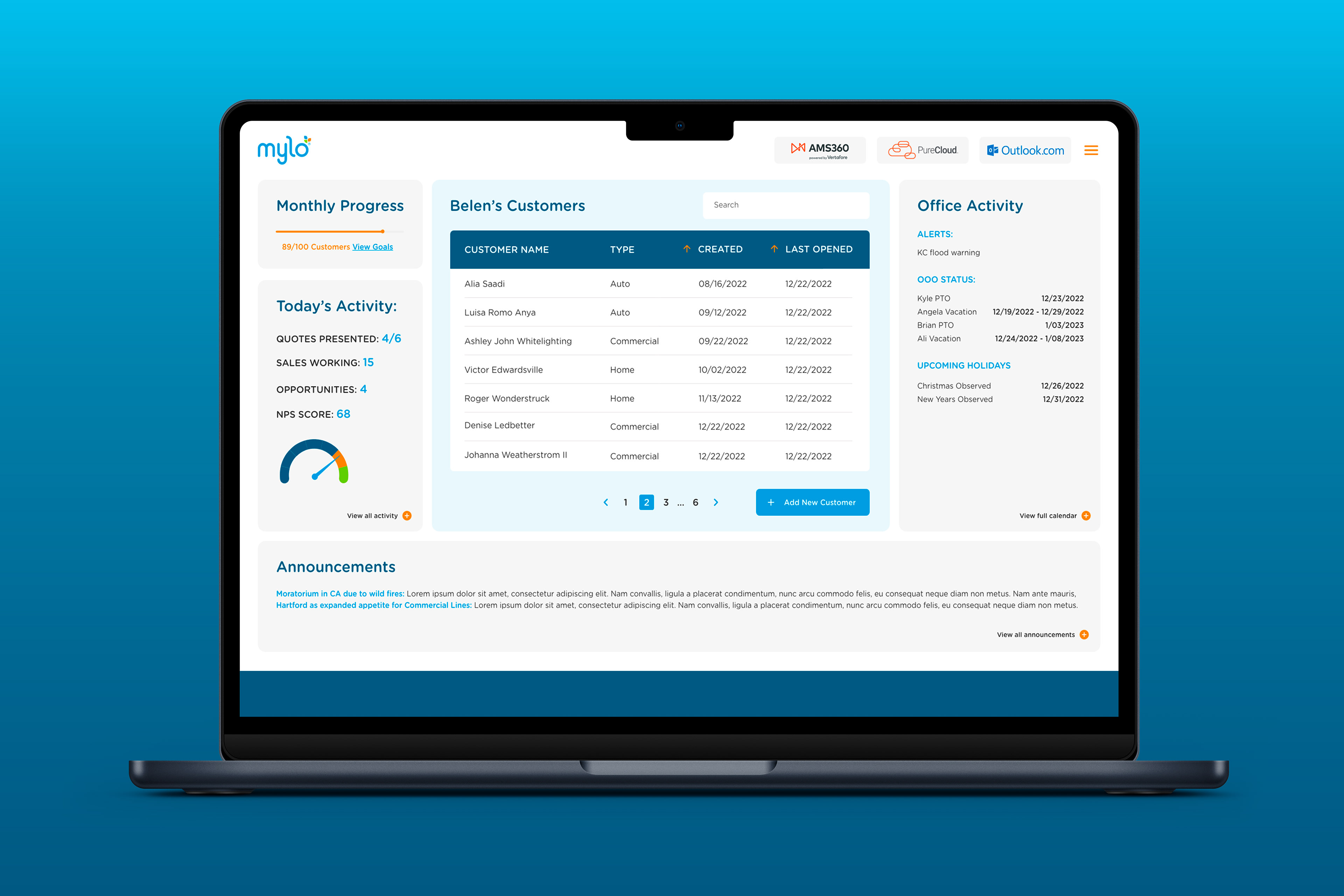
| More real estate needed please
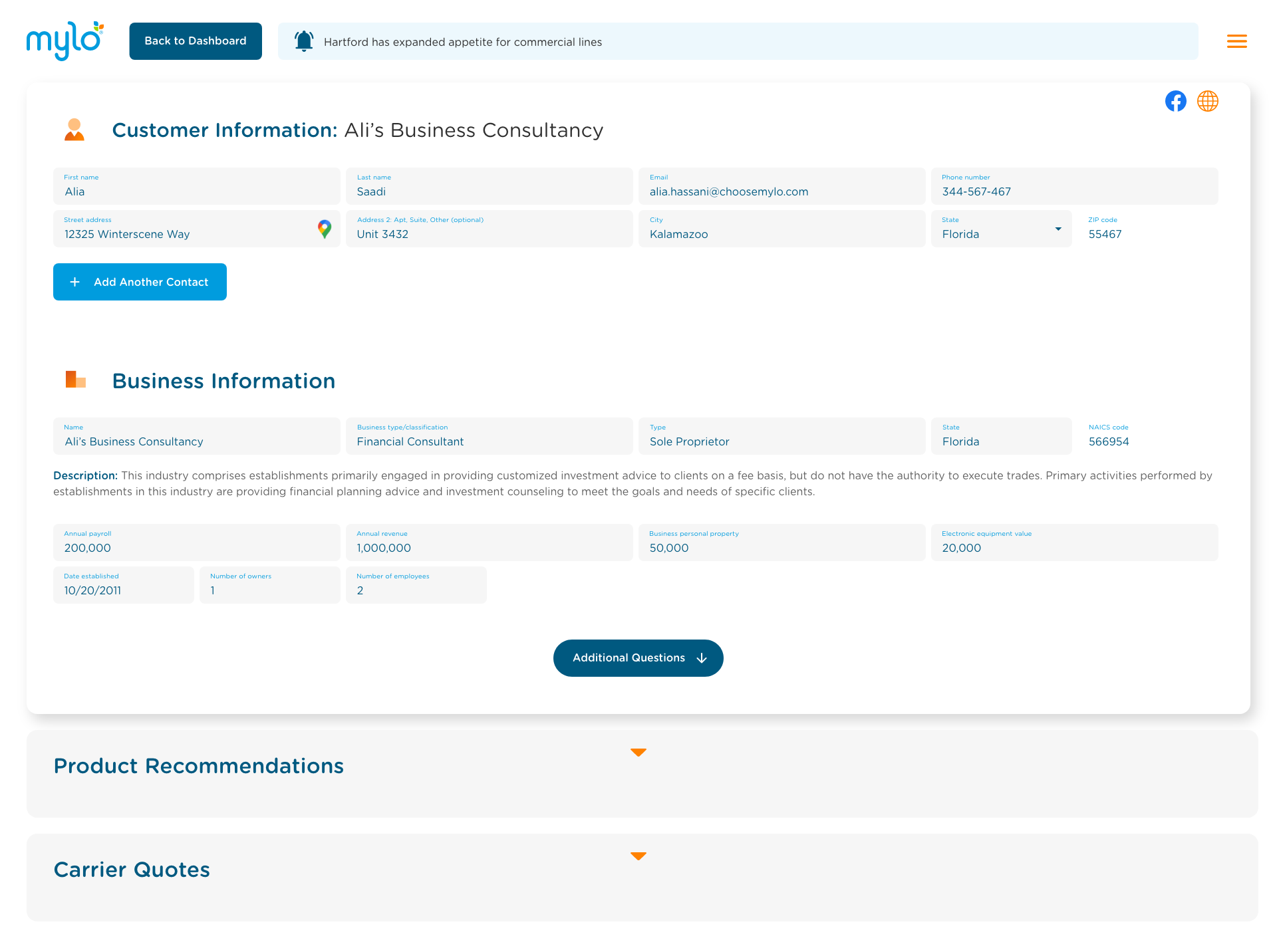
As the dashboard evolved to accommodate more information and additional sections, working with an UX teammate we transitioned to a more modular layout. Customer pages were redesigned with a vertically stacked structure, using expandable drawers and small pop-up modals to organize content in a clear and digestible way.
| More detailed And interactive quote cards
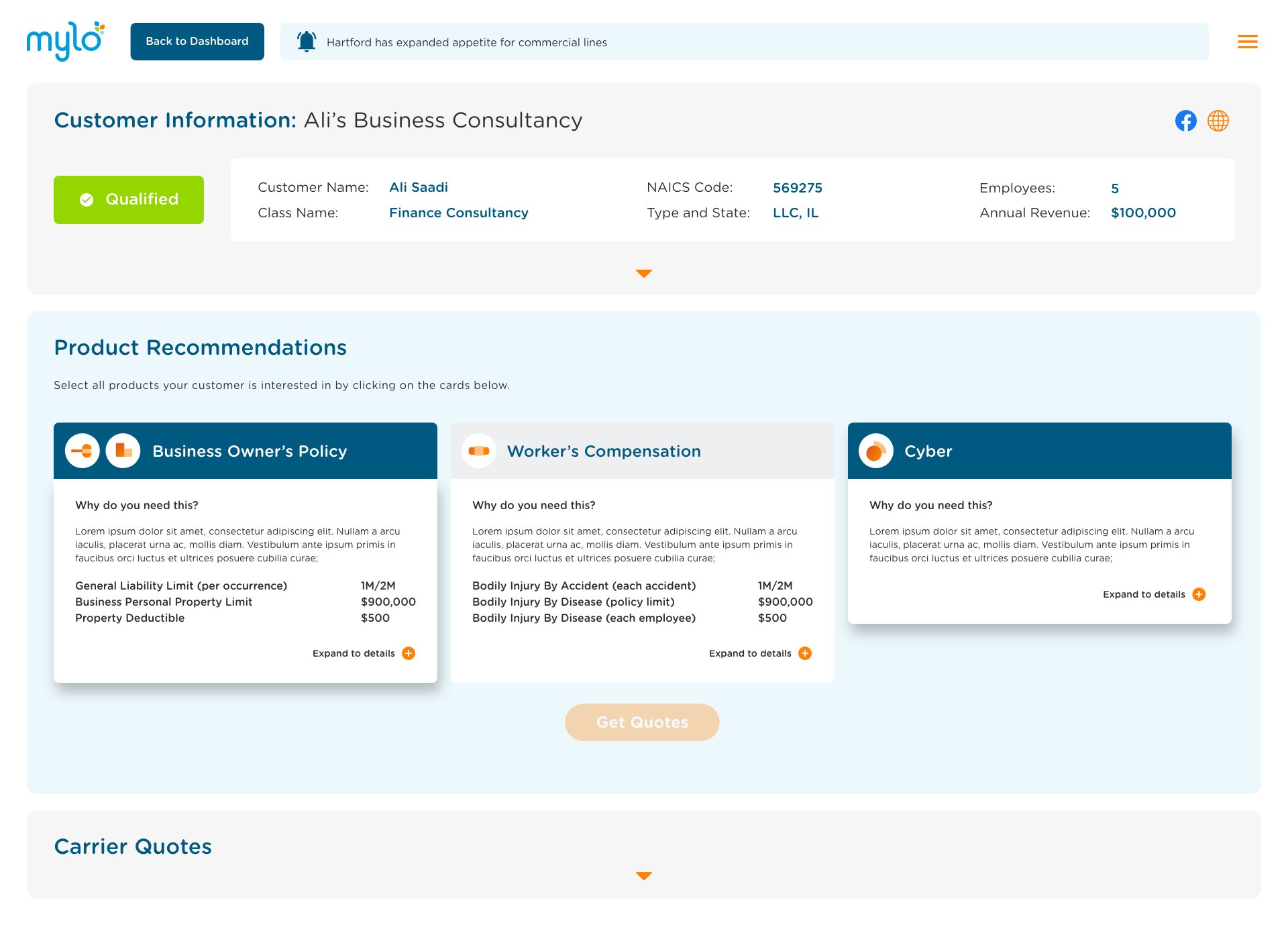
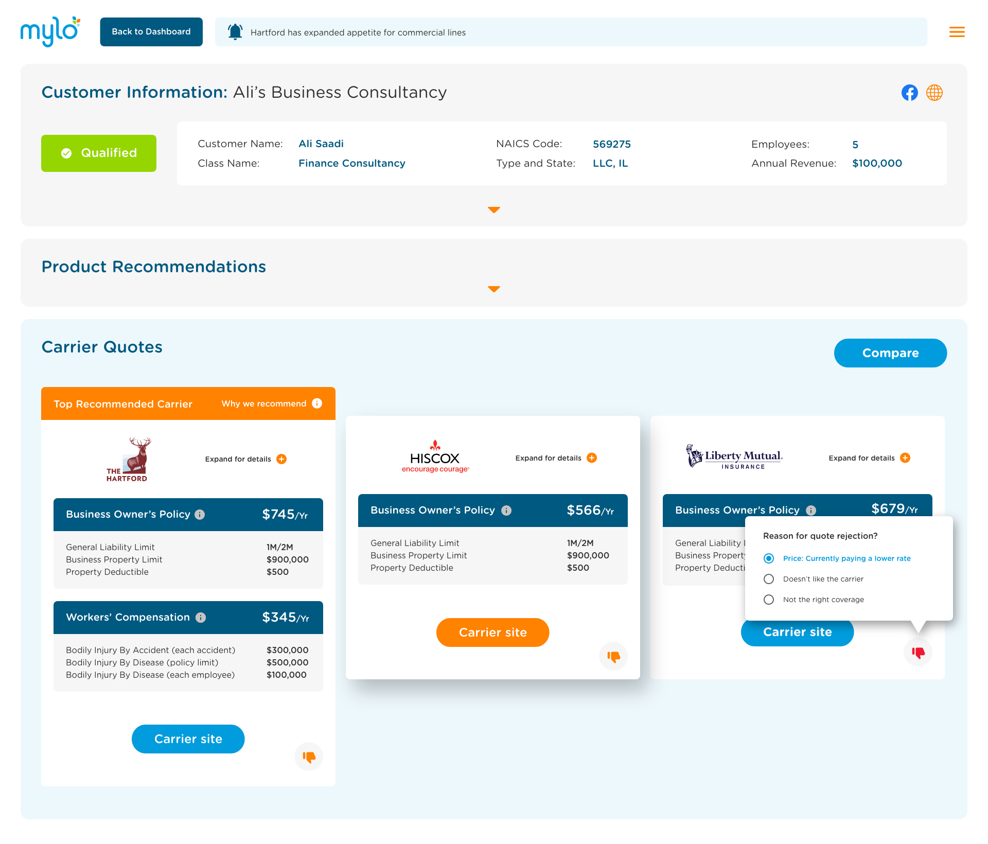
We added new functionality to the quote cards to show a top recommend product, customer feedback options and buttons linked out to the carrier sites.