Mylo Insurance
When updating Mylo’s icon library, I refined diverse visual styles into a cohesive system, distilling complex insurance and technology concepts into clear, accessible marks. Through strategic use of brand colors, gradients and shape, I developed an intuitive visual language that balances simplicity with depth.
iconography | Branding


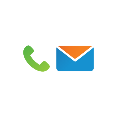
| Marketing & presentation icons
These icons played a key role in Mylo’s visual identity, appearing across emails, marketing collateral, and the website. They were designed to clarify aspects of Mylo’s communication and business development, representing concepts like technology, customer experiences, and product shopping. Creating a cohesive icon library was a rewarding and enjoyable process.


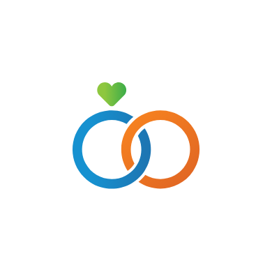
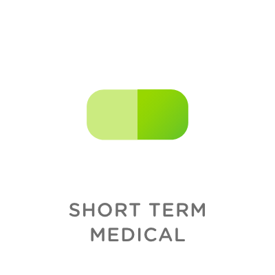
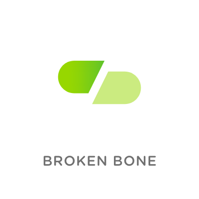
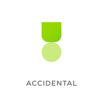
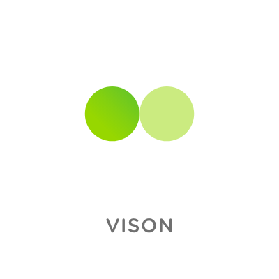
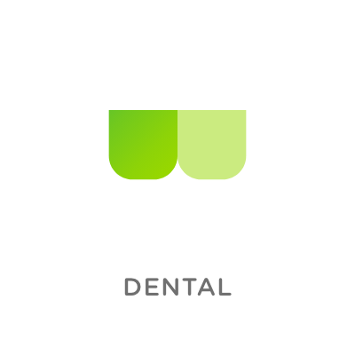
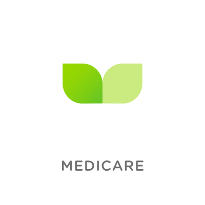
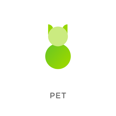
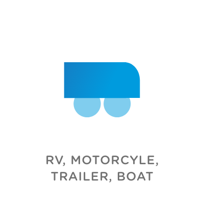
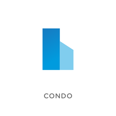
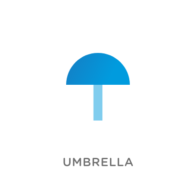
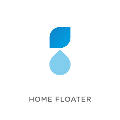
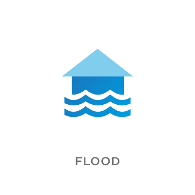
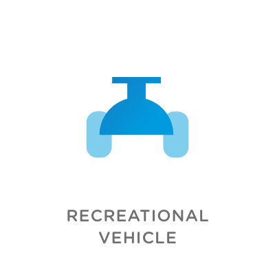
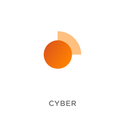
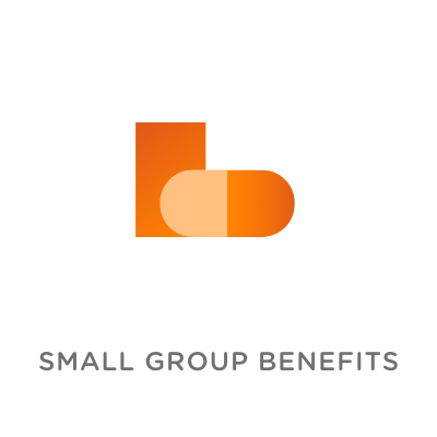
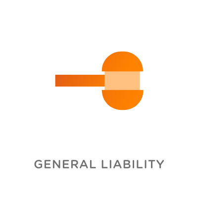
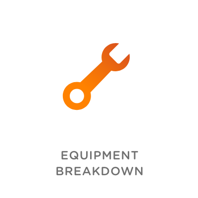
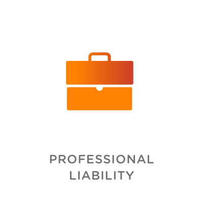
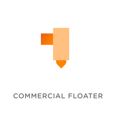
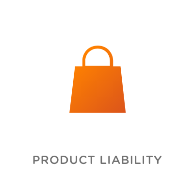
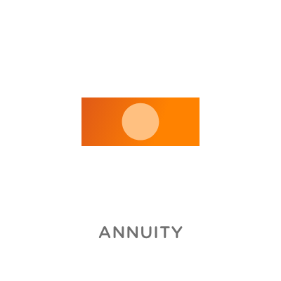
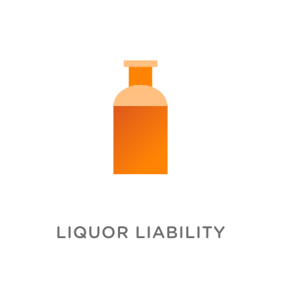
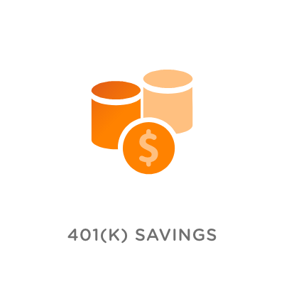
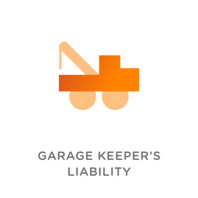
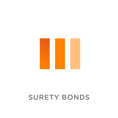
| Product icon development
Mylo’s branding incorporated simple shapes to enhance visual interest, whether used in small groups or larger patterns. When expanding their product icon library, these shapes were combined in various ways to create minimal, versatile icons that could be used across materials featuring Mylo’s insurance products. I also added soft gradients to give the icons more dimension and to connect them with the broader illustrative style used throughout Mylo's expanded branding. The icons were organized into three distinct categories: Life & Medical (green), Personal (blue), and Commercial (orange).


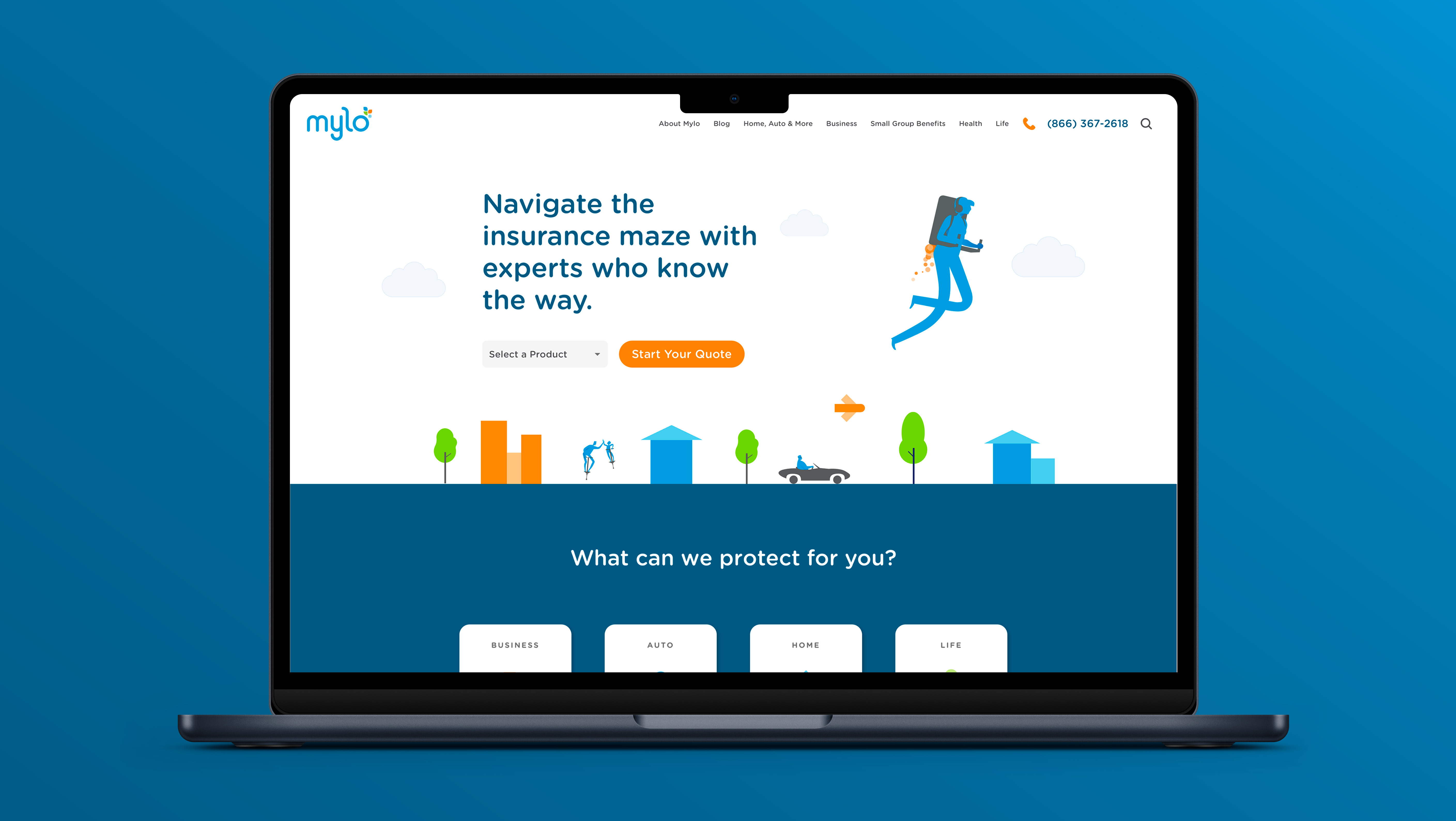
| Addition of buy-flow icons
As part of redesigning Mylo's buy-flow, we aimed to bring the brand into the shopping experience. One way we accomplished this was by adding icons to highlight key aspects and visually anchor sections of the purchasing flow. Examples include icons for adding a driver or vehicle to car insurance, as well as for sections like marital status and contact information.