Bank of the Prairie
Bank of the Prairie wanted to revamp its branding and advertising to better reflect its identity, make a stronger visual impact, and connect with the community. After reviewing existing materials, we found inconsistencies in fonts, colors, and logo use, along with staged photos that didn’t reflect the bank’s personal service.
As the lead designer, my team and I developed new branding, including print and digital assets, featuring testimonials from banking partners who had exceptional experiences with the bank.
creative concepts | Branding/logo design | Graphic design




| starting with Brand Identity
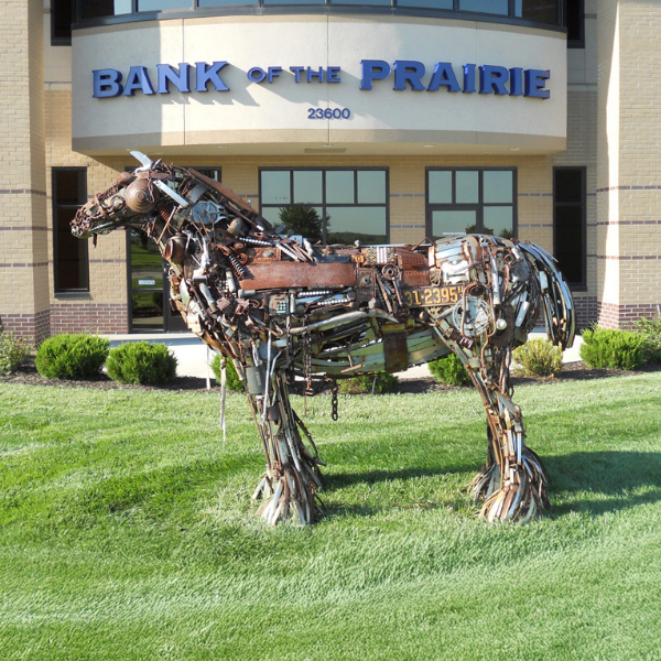
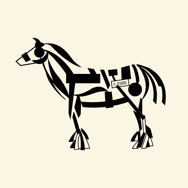
The logo was inspired by the iconic horse sculptures at each bank. Through sketches and iterations, I created a final icon that represented strength and dependability—key values the bank wanted to communicate.
The color palette was inspired by the metallic, rusted, and weathered tones of the scrap metal sculptures, providing the increased visual impact we sought.
| Original designs for review and reference.
| advertising centered around banking partnership RELATIONSHIPS
This approach conveyed a more personal message, emphasizing that Bank of the Prairie is your hometown Olathe community bank—one that understands individuals, their unique interests, dreams, and desires, and helps them achieve their goals.
| rebranded website with a header that featured the bank presidents testimonial of personal commitment

